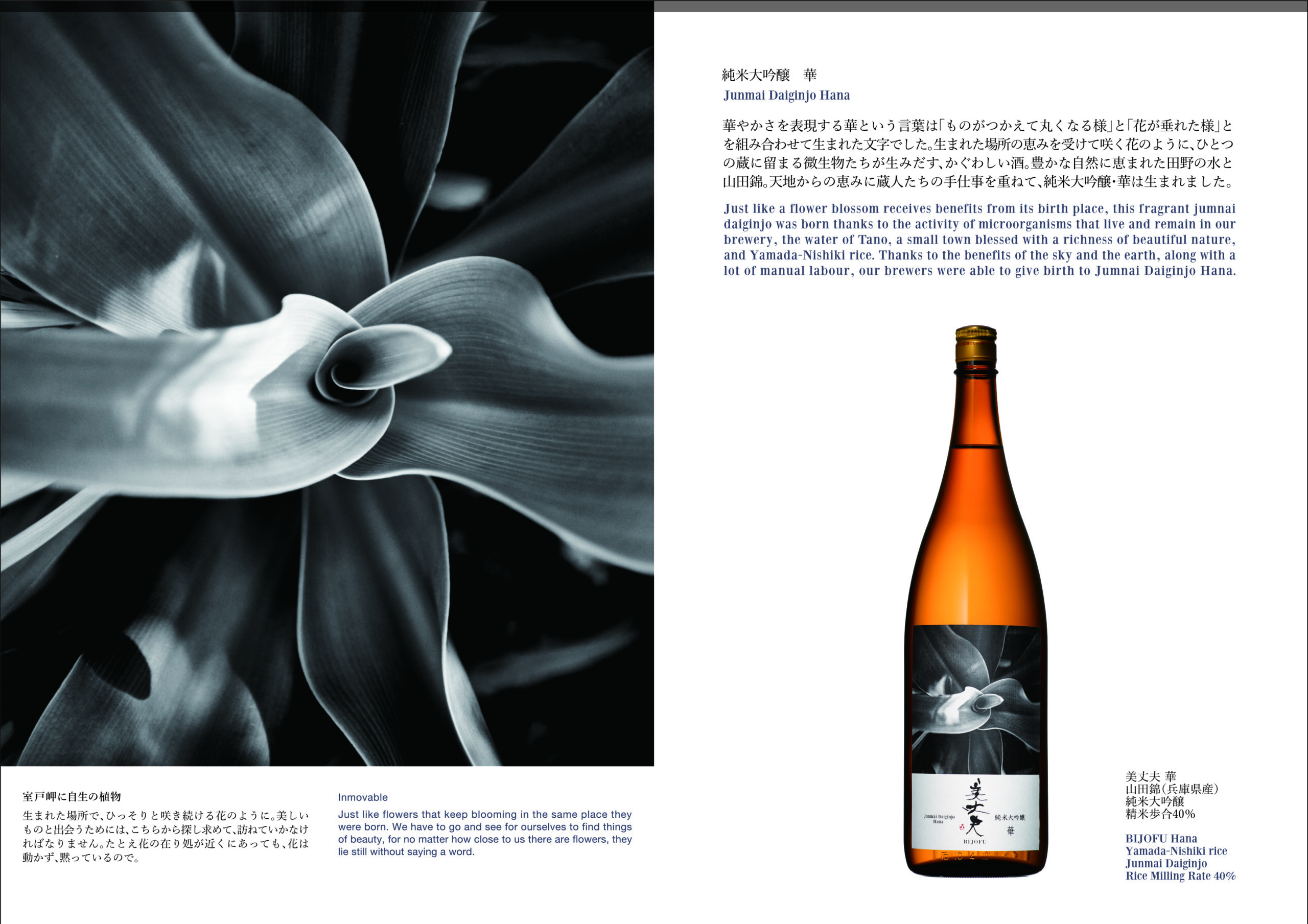
Bijofu
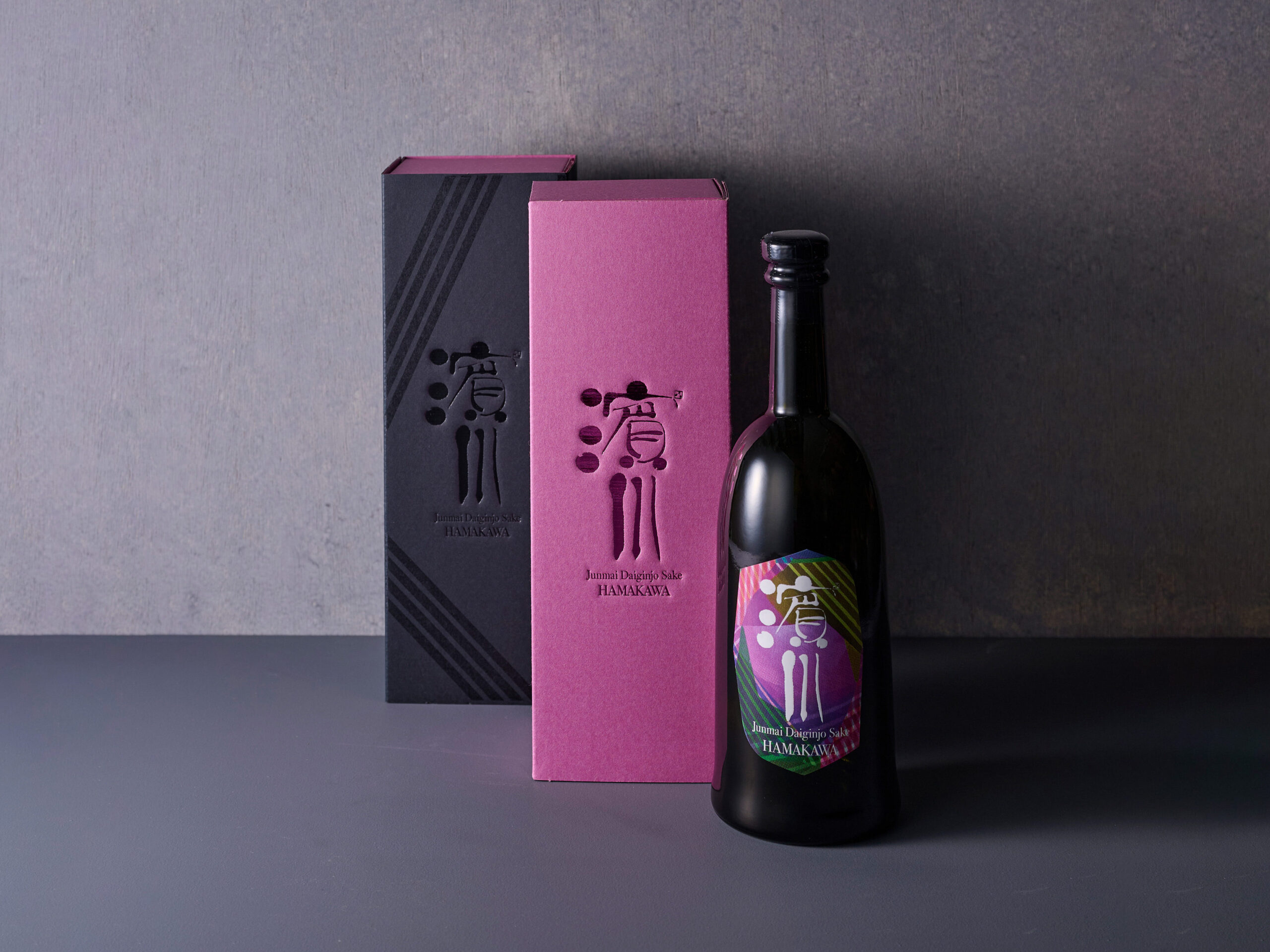
高知の銘酒「美丈夫」ラベルデザインリニューアル。土佐の自然の恵みへの感謝と地元への貢献を表現する。
Renewal of the label of Kochi’s famous sake “Bijofu”.
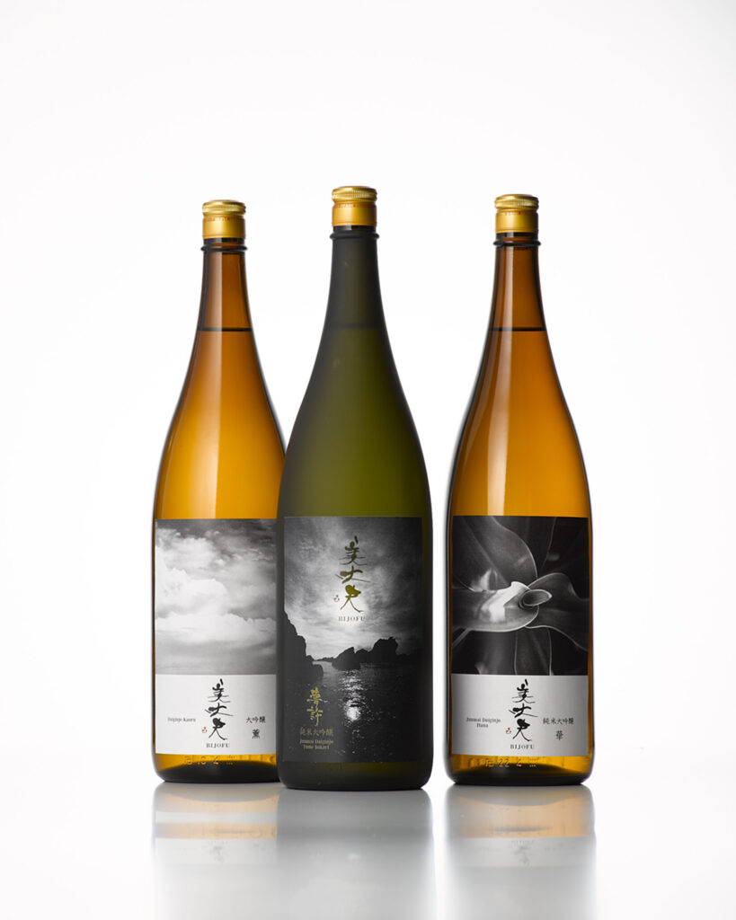
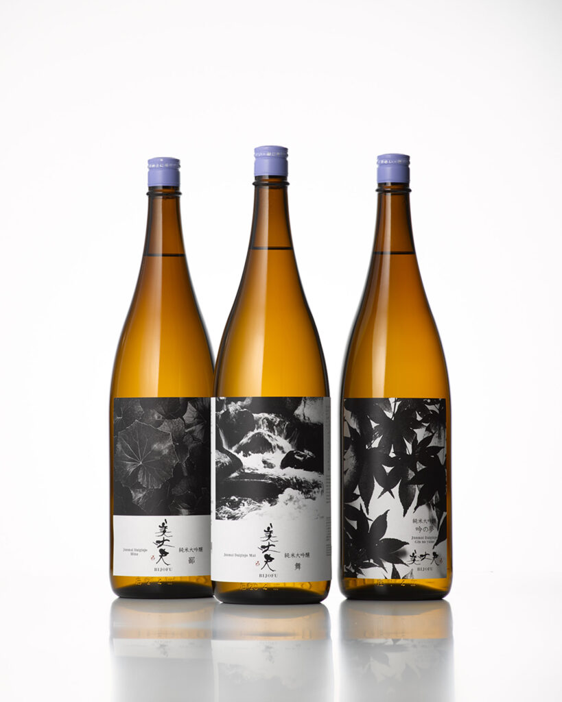
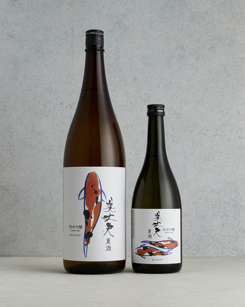
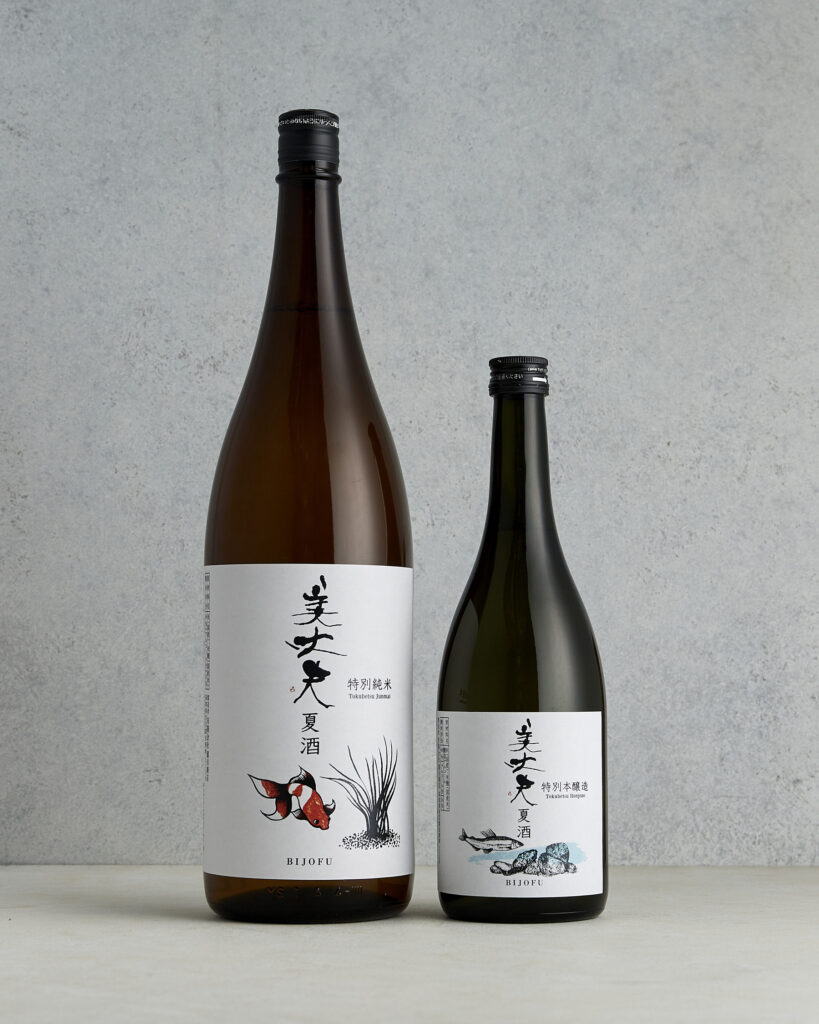
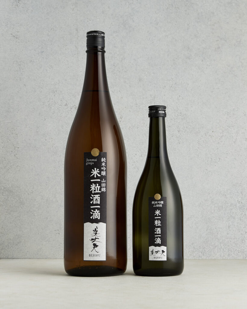
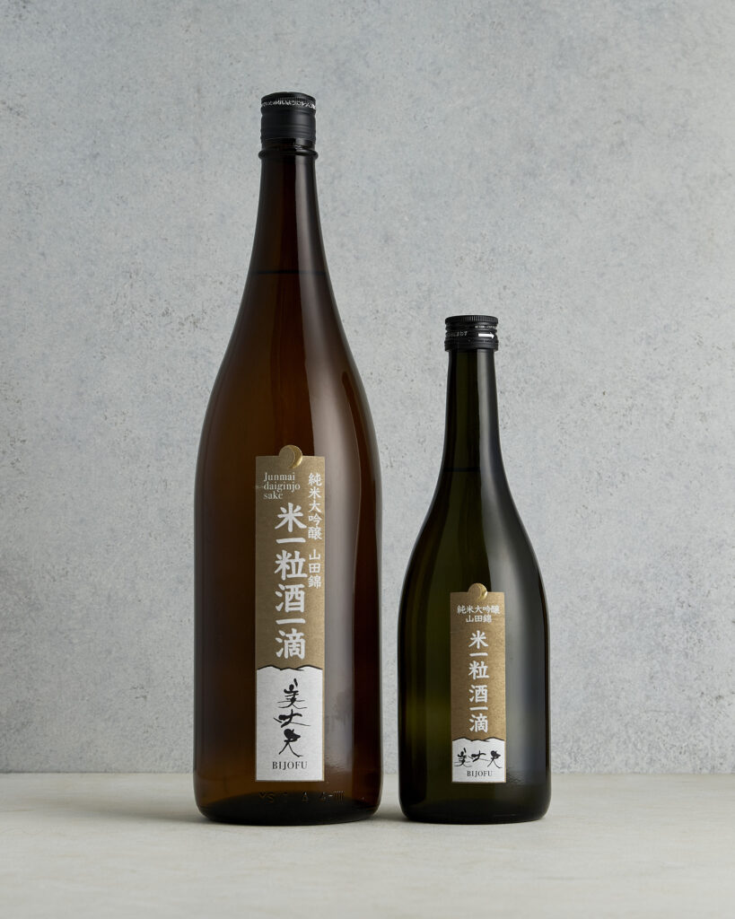
土佐の自然の恵みに感謝を込めた酒ラベル
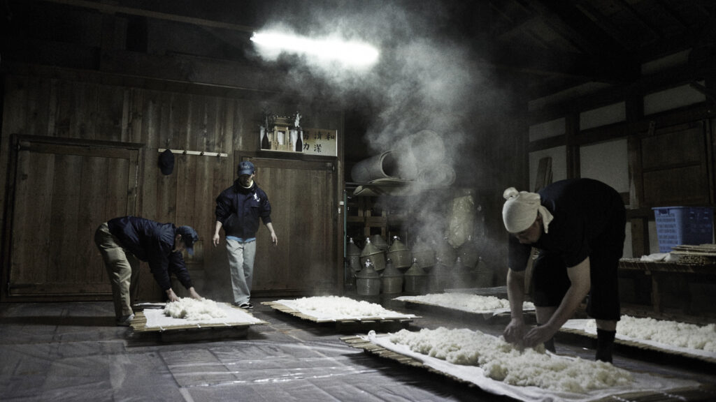
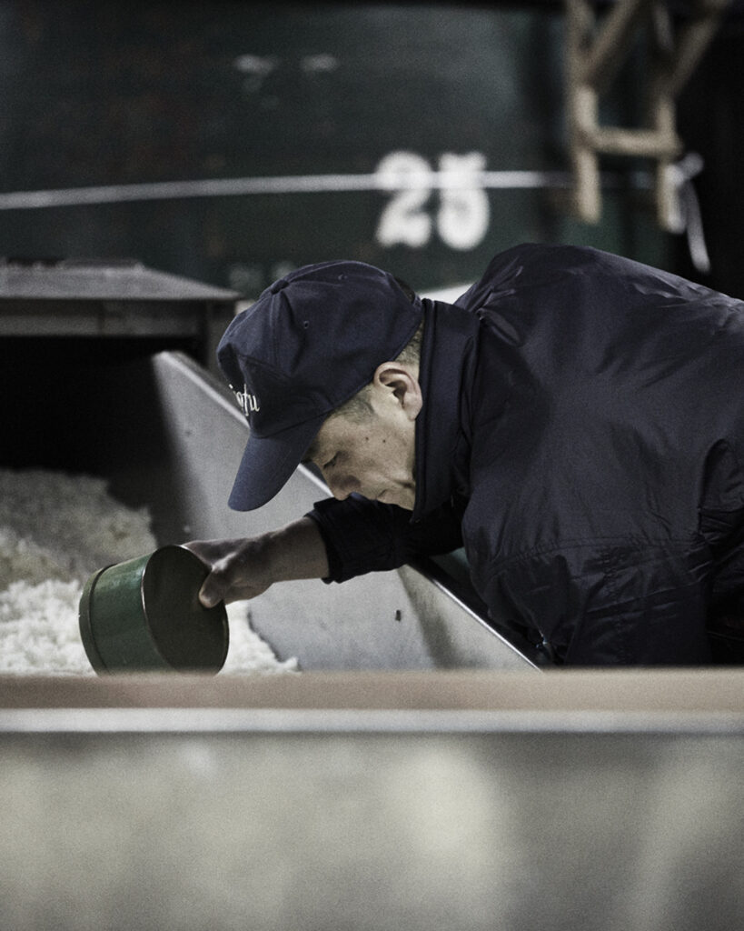
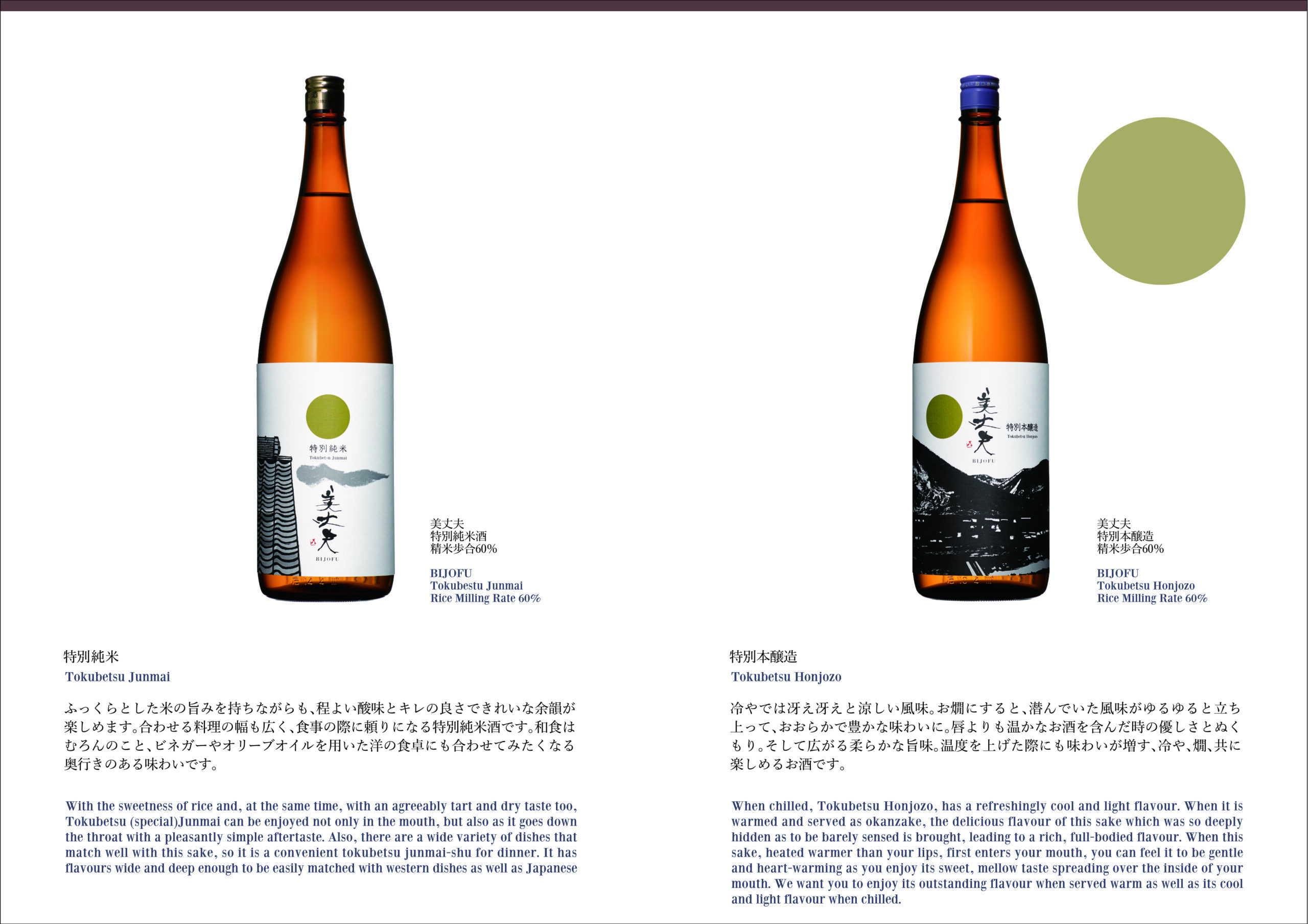
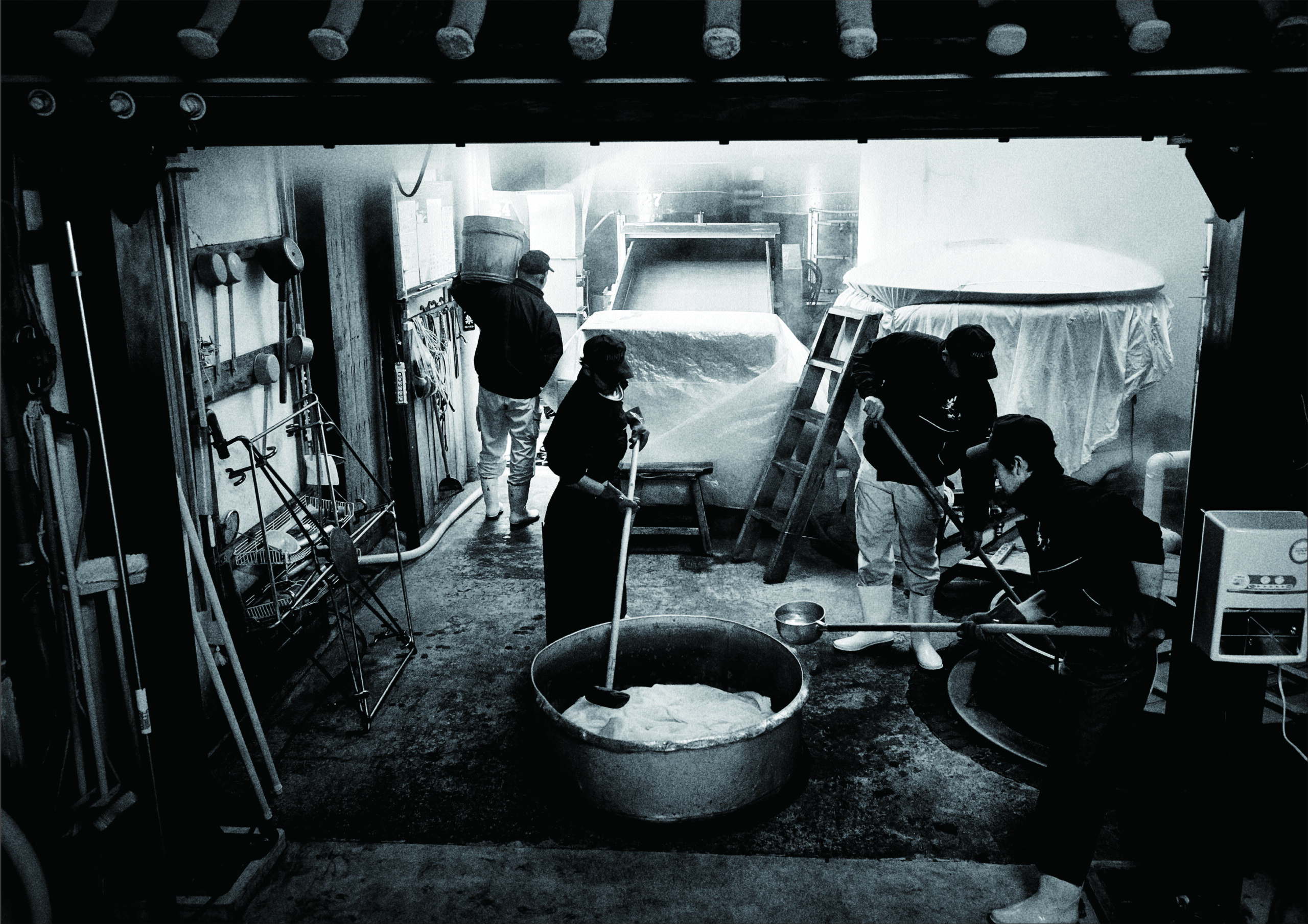
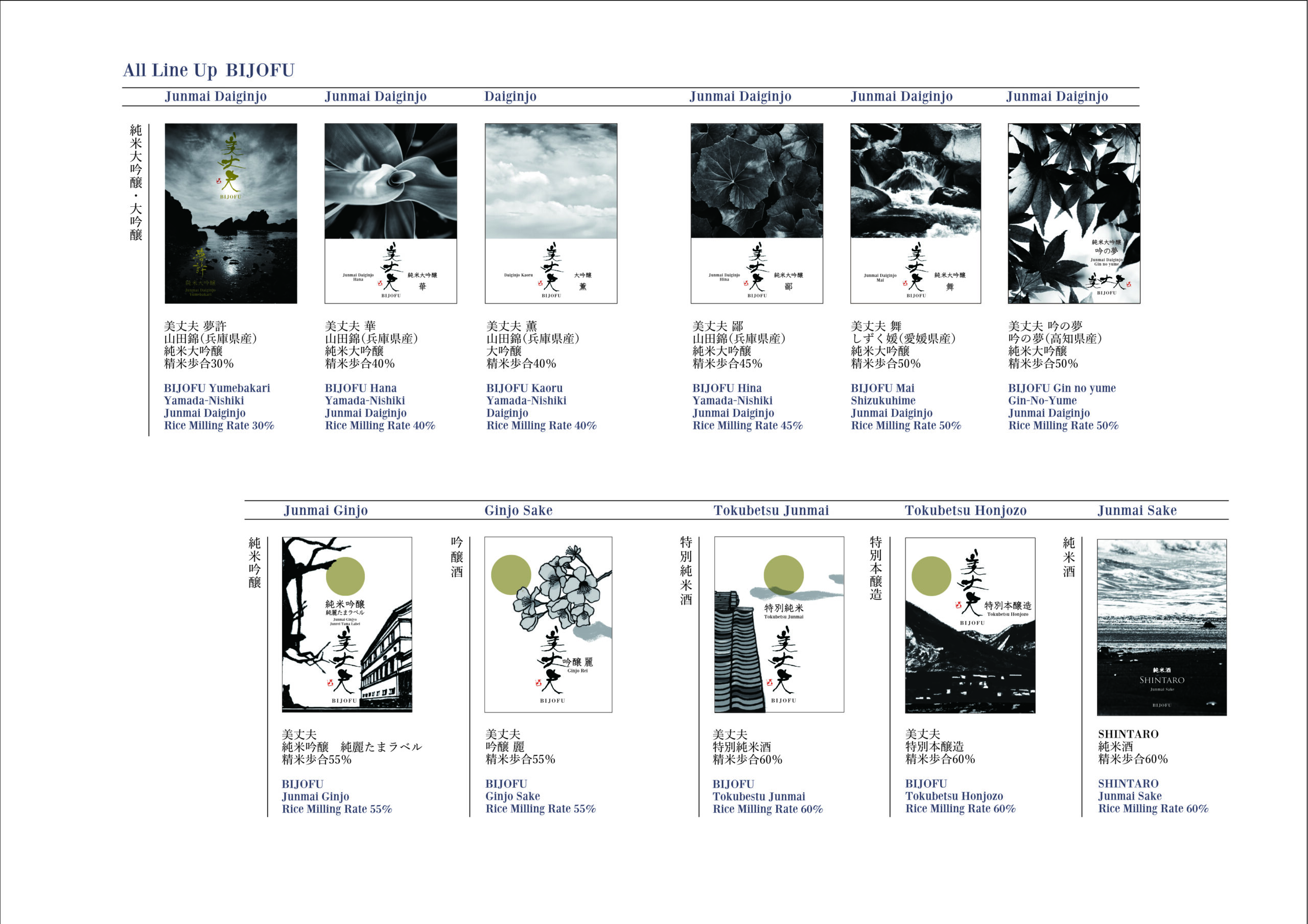
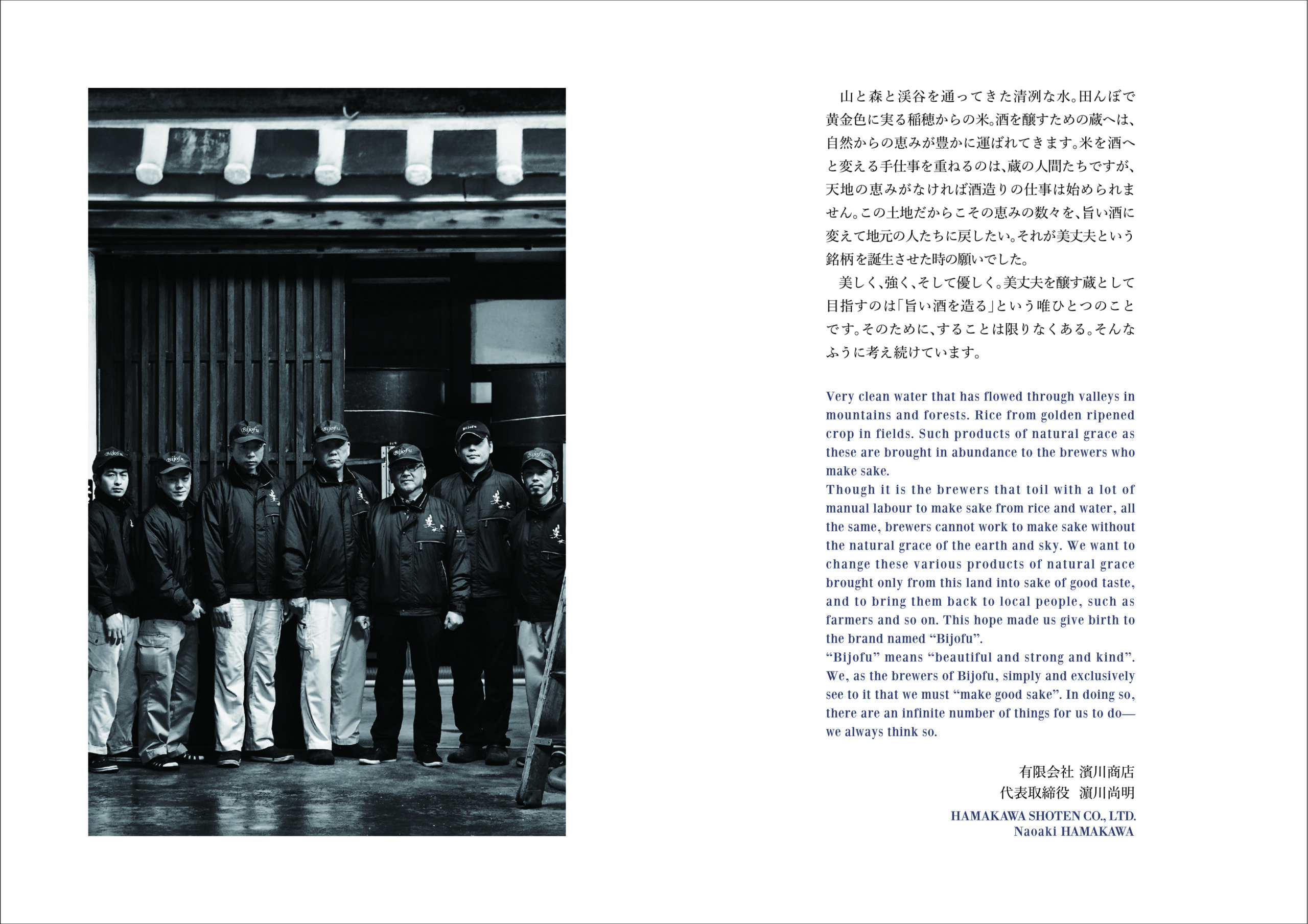
1904年、高知にて創業の酒蔵である濱川商店の「美丈夫」は、年間生産石数1500石と、高知を代表する銘柄となっています。
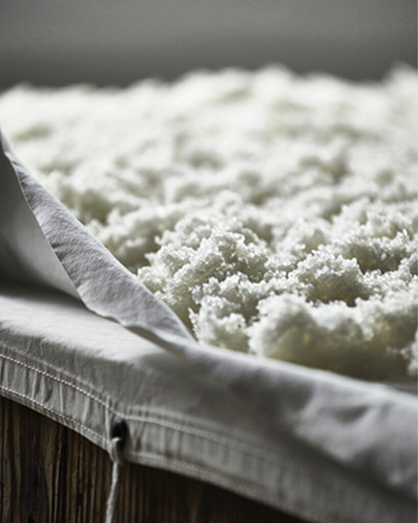
3代目より、土佐の自然の恵みである水と米から作られた美味しい酒で地元に貢献する、という思いを込めたラベルのデザインを依頼され、ラベルデザインのリニューアルと連動し、オンラインストアのサイトデザインも行いました。
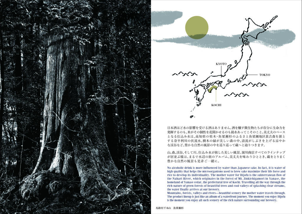
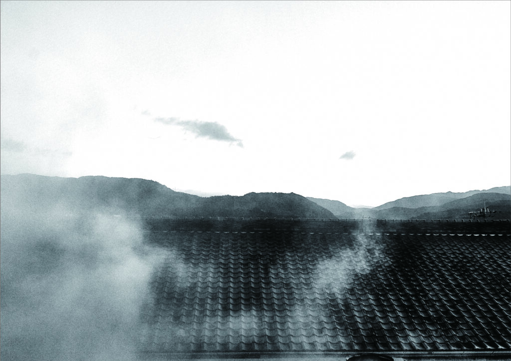
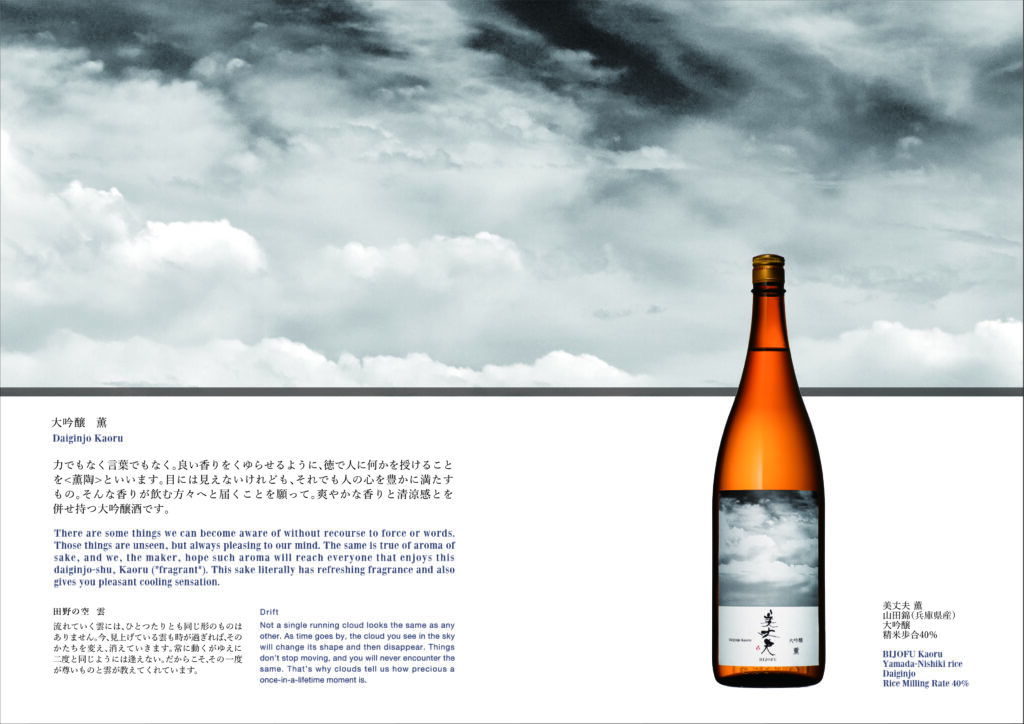
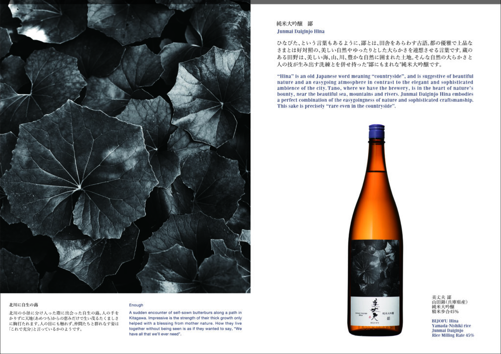
近年の世界的な日本酒ブームの波に乗り、業績は好調の中、クオリティの高い酒づくりができたこと、その背景には高知の豊富な自然資源があってこそと地元の恵みに感謝し、これからは地元に還元したいという当主の願いを汲み上げ、コンセプトを立案。豊かな自然溢れる高知の海や山の写真とイラストレーションで表現しました。
ラベルのリニューアル後、国内外での売上がさらに向上。なかでもパリでのブランド認知度の高まりとともに、2023年、ユニクロパリで発売予定のグラフィック T シャツブランド「UT」のデザインに、川村明子のイラストによる美丈夫 吟醸 秋酒のラベルに描いた猫の図柄が採用されました。
Sake labels expressing gratitude for the blessings of nature in Kochi
Hamakawa Shoten, a sake brewery founded in 1904 in Kochi, produces 1,500 koku per year, making “Bijofu” one of the most popular brands in Kochi.
We redesigned the label to reflect the idea of contributing to the local community with delicious sake made from Tosa’s natural bounty of water and rice, and also designed the online store site to match.
The concept was drafted based on the head of the brewery’s desire to give back to the local community and his gratitude for the local blessings, which he attributes to Kochi’s abundant natural resources, and his ability to produce high quality sake amidst the recent global sake boom and strong business performance. The concept was expressed through photographs and illustrations of Kochi’s beautiful sea and mountains.
Since then, sales have further increased both domestically and internationally. In particular, as the brand’s recognition grew in Paris, Akiko Kawamura’s cat design on the label of Bijou Ginjo Autumn Sake was chosen for the “UT” T-shirt design to be launched at UNIQLO Paris in 2023.
Client:
Hamakawa Shoten Co., Ltd.
Sector :
Sake brewery
Capabilities :
Rebranding
Logo design
Website design
Product package design
Graphic design
Year :
2015-Present
Related Works